Learnings from building a design system
Company
Urban.io
Role
Product designer
Duration
2021-2022
Preparing Urban.io’s IoT platform for its first Progressive Web App release and the need for dark mode support revealed a growing gap between design and code.
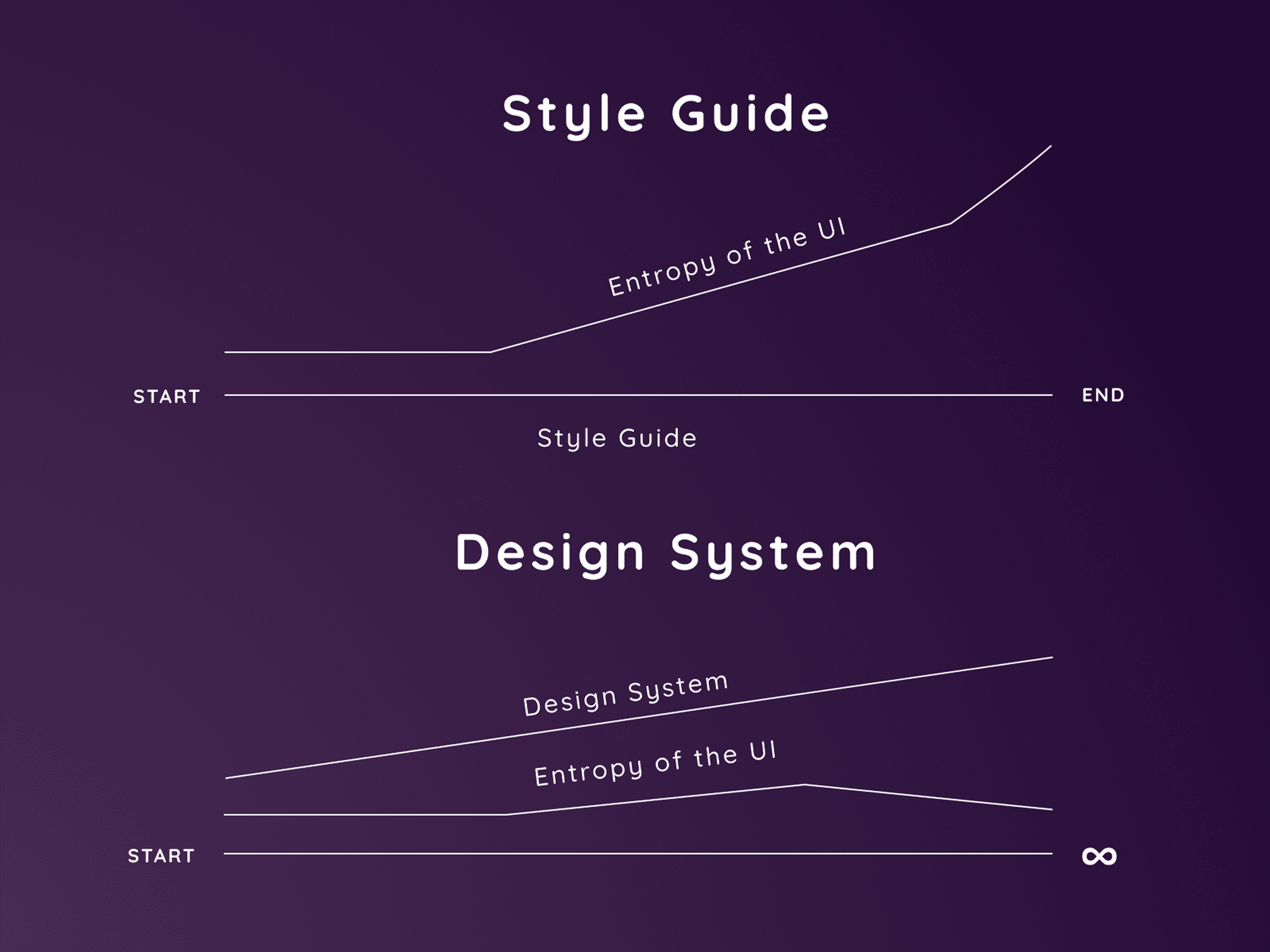
Our original strategy was to build a custom UI library inspired by Material Design.
But while design decisions were semantically grounded, the code diverged over time.
Themes, states, and components didn’t match visually or structurally.
We needed to realign design and development around a common semantic language that linked Figma and code one-to-one.
Approach
We introduced a semantic token framework to define every visual decision — color, type, spacing, and state — as a reusable value shared by both design and development.
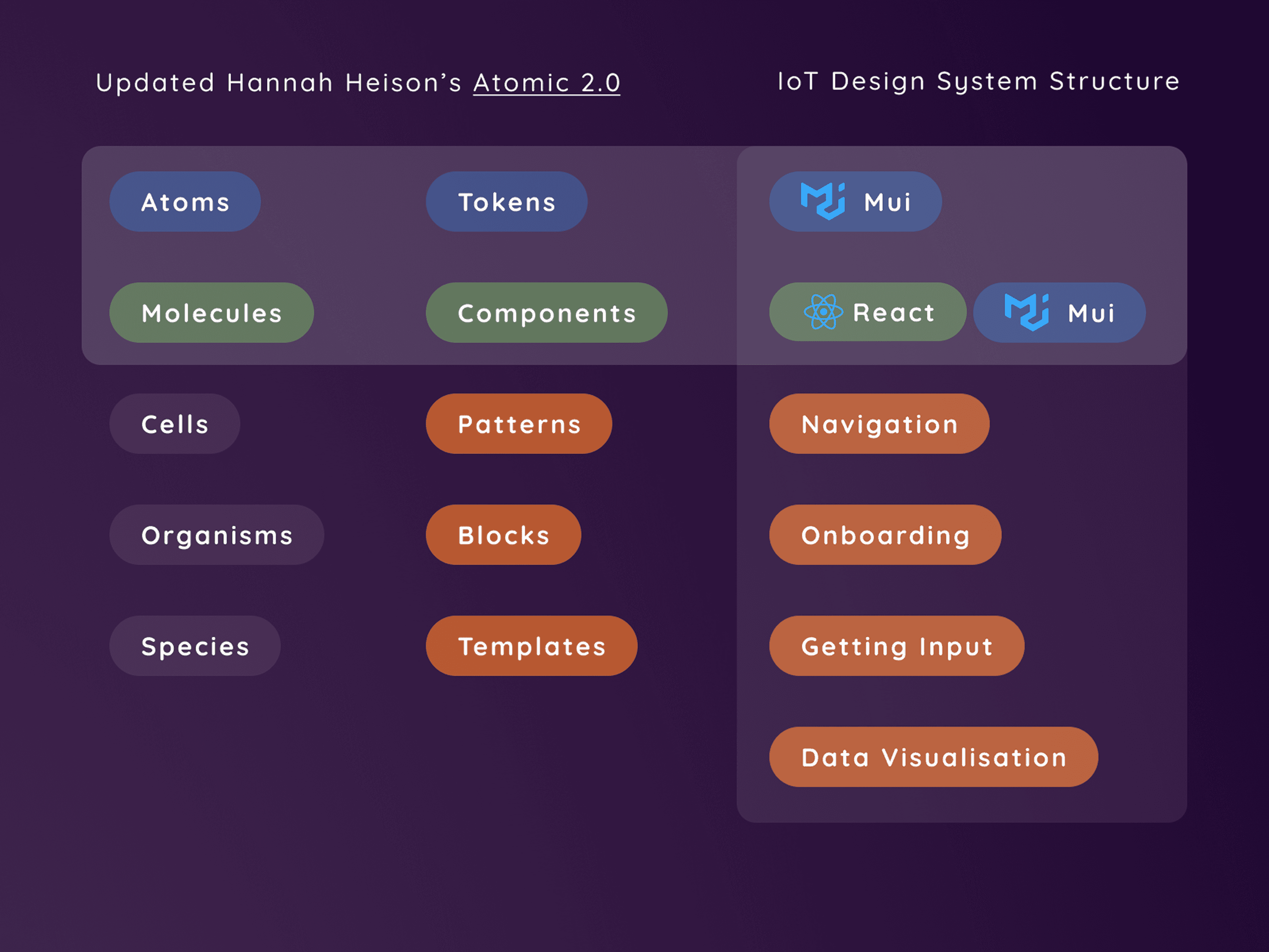
The structure followed an Atomic 2.0 logic:
Atoms → Tokens (foundations and states)
Molecules → Components
Organisms → Blocks
Species → Templates
Tokens integration
A new Figma–GitLab pipeline automated token synchronization.
Every design update — from button colors to elevation levels — could now be reflected instantly in code.
This workflow eliminated translation errors, improved speed, and gave developers full confidence in visual consistency.
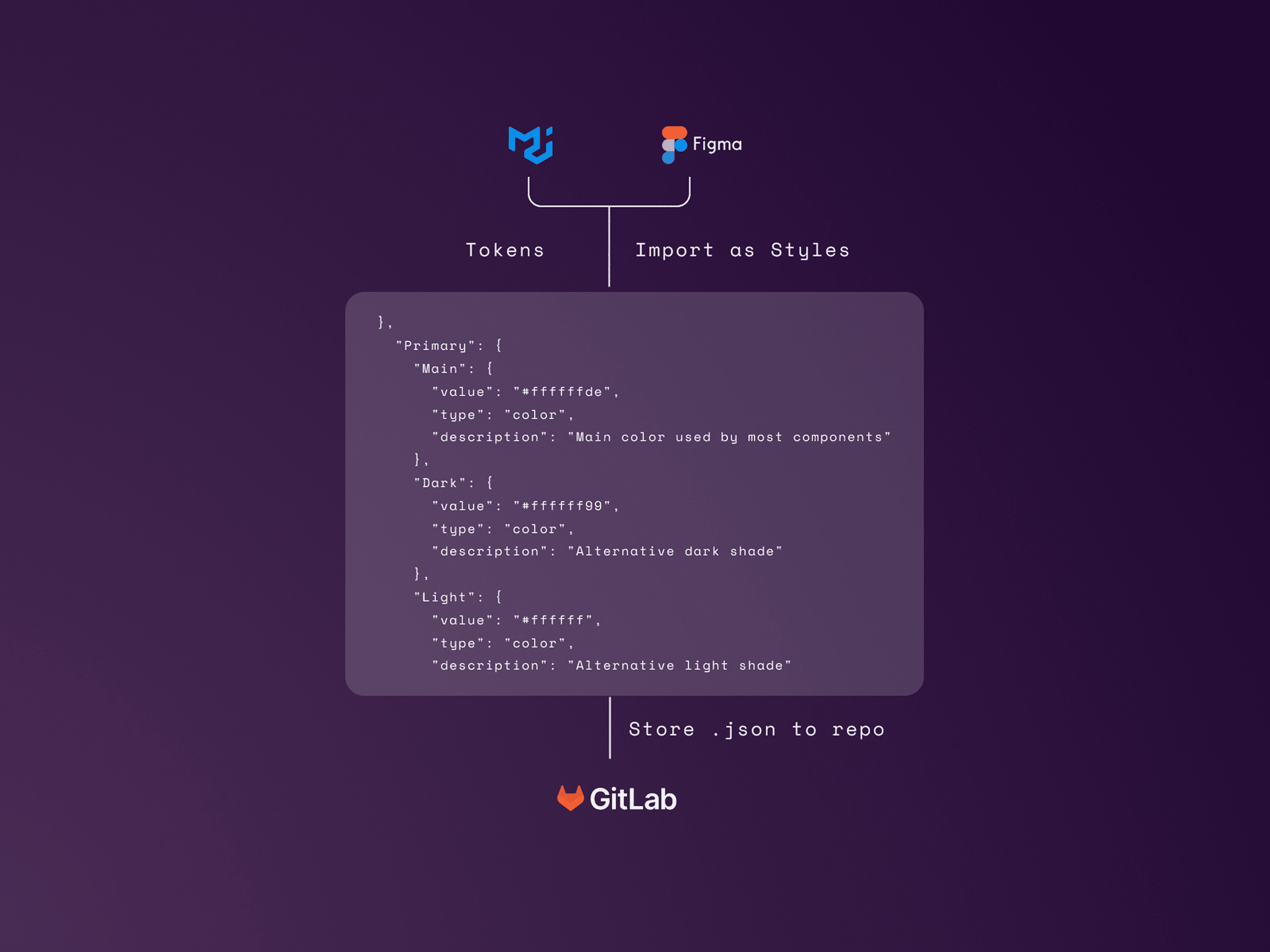
Semantic token hierarchy mapping structure, states, and modes.
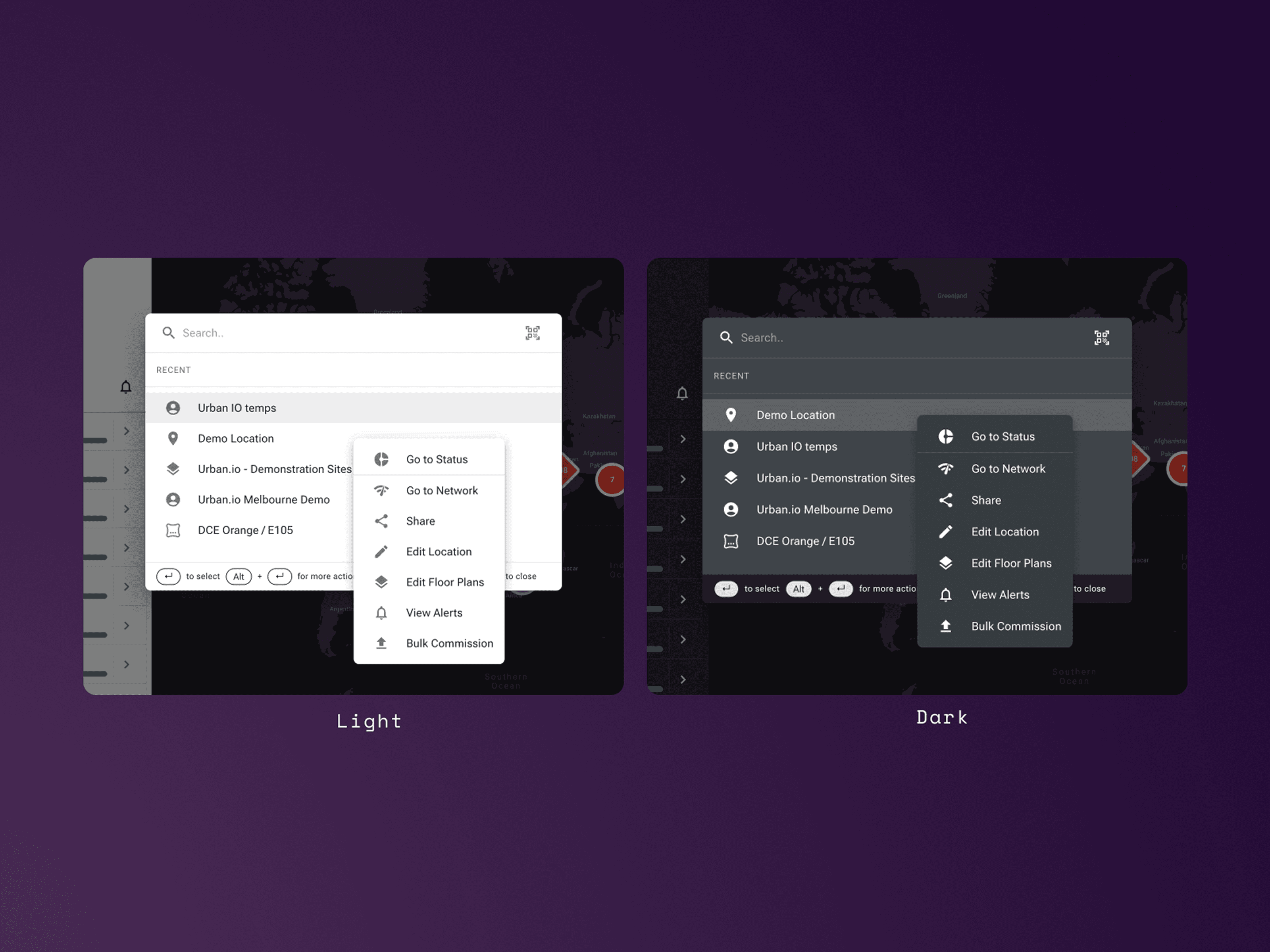
Light & Dark Modes
With semantic tokens in place, we unlocked proper light/dark theme support.
Tokens controlled contrast and accessibility ratios automatically, ensuring parity across all PWA interfaces.
Brand flexibility no longer required rebuilding components — it became a matter of adjusting system variables.
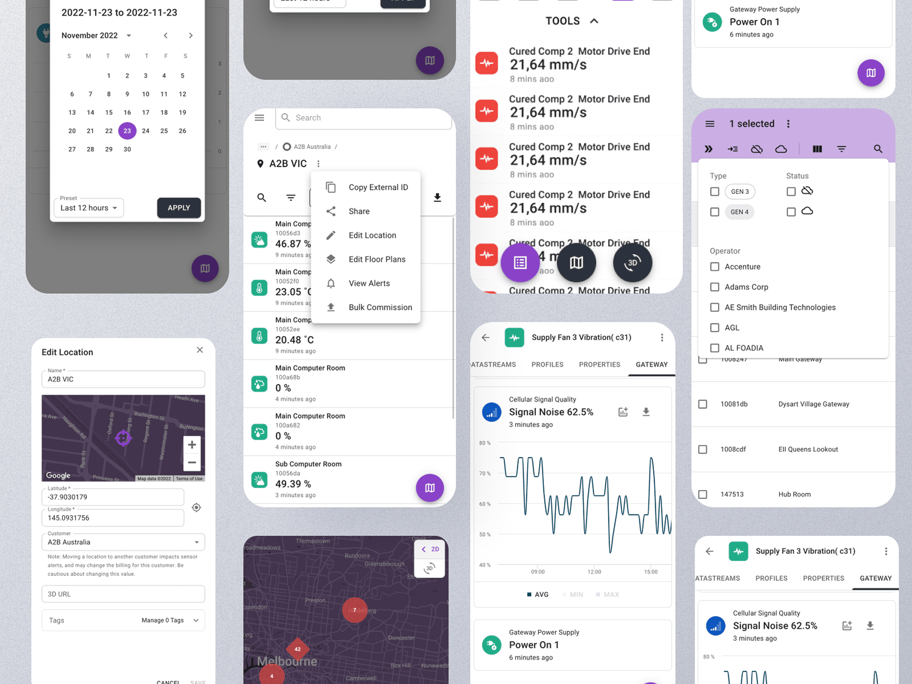

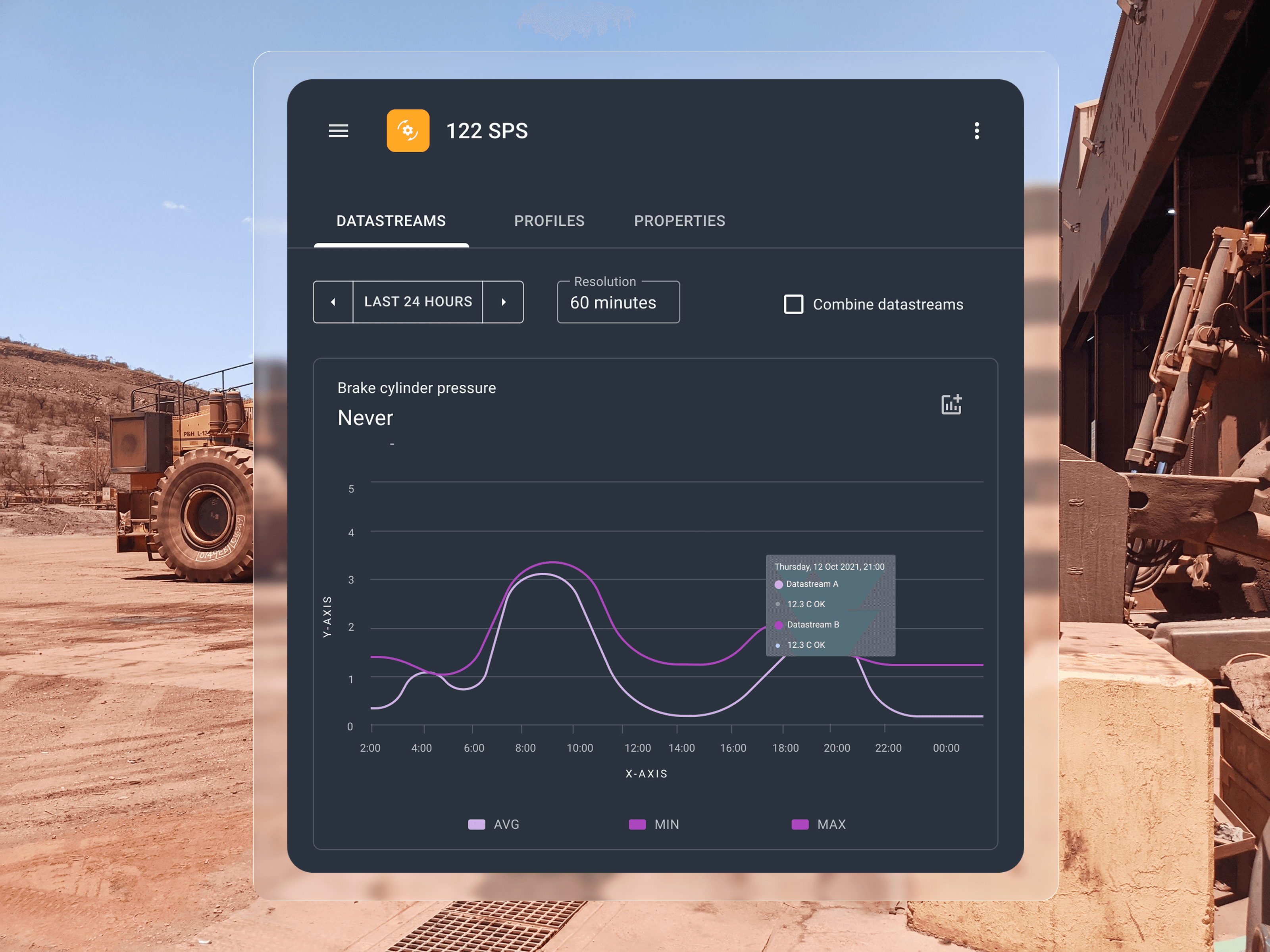
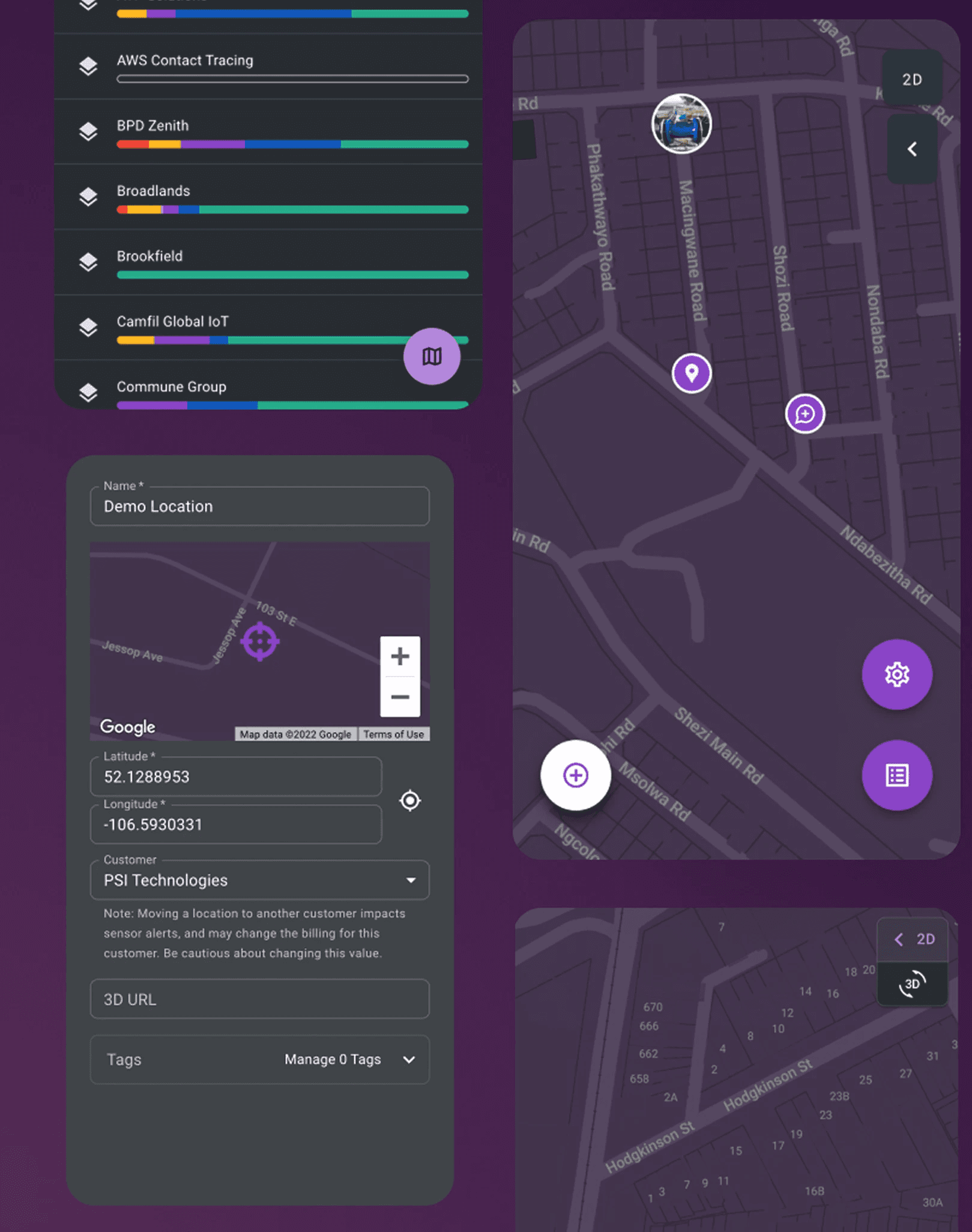
System in action
The new system powered the PWA rollout and all future product modules.
From monitoring dashboards to analytics tools, components were now fast to implement and visually aligned — regardless of environment or mode.
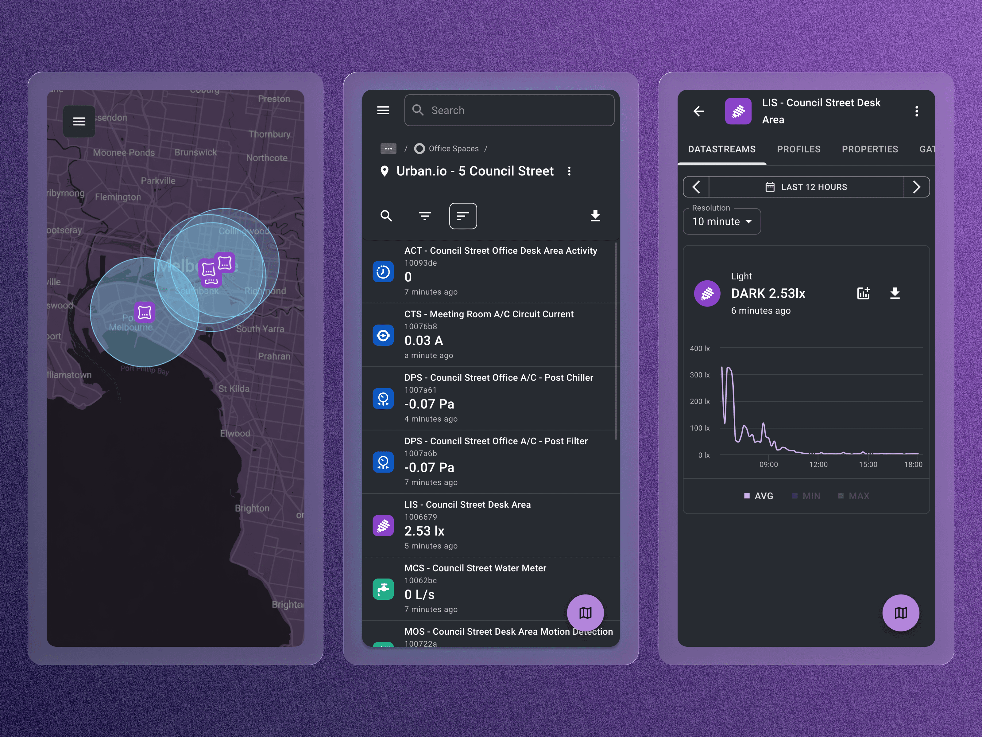
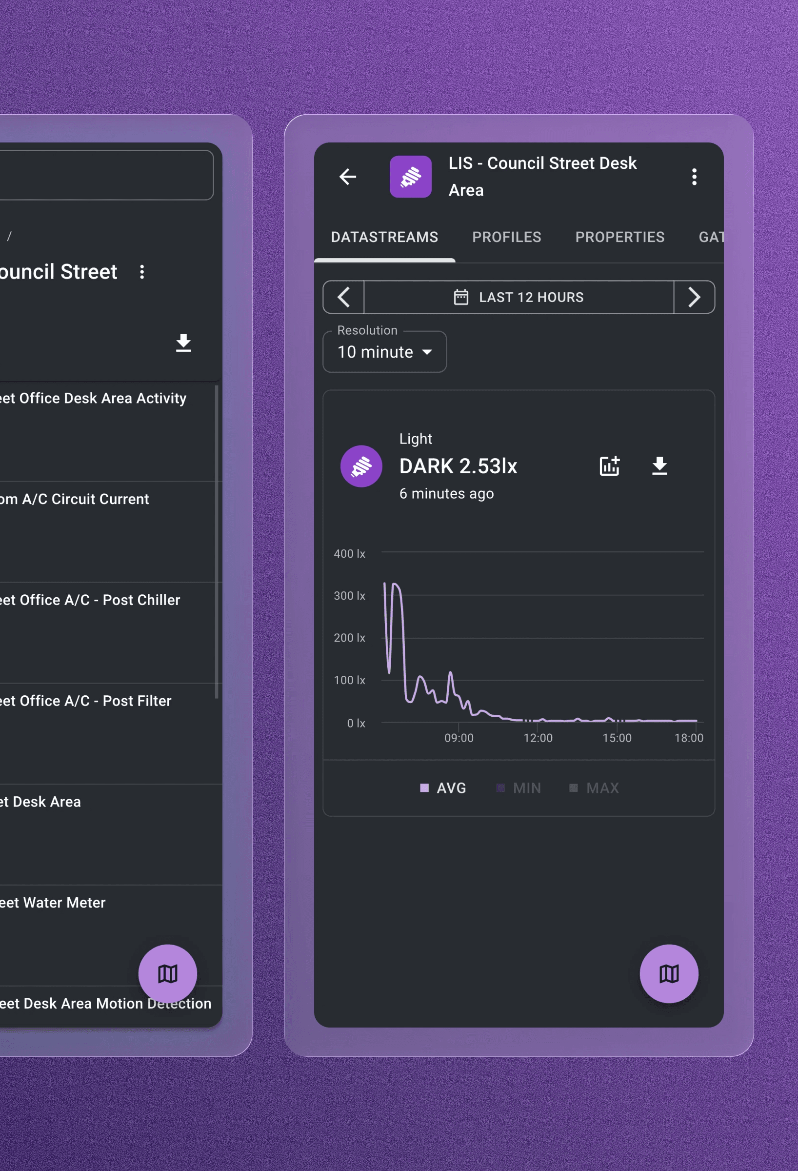
Applied components in production: unified dashboards and data vis.
Outcome
The token-based design system bridged the gap between design and code.
It aligned teams around a single language, enabled dark/light theming, and laid the foundation for scalable PWA performance.
Aligned design and development through shared semantics
Enabled PWA scalability and dual-theme parity
Reduced design–dev friction
Learnings
True scalability comes from shared meaning, not shared visuals.
By grounding every design decision in semantics, we built a system that could evolve — not just look consistent.
“When design and code speak the same language, progress becomes exponential.”
View more projects


